Friday, November 30, 2012

Abstracts

I have other new sketches and painting to post... maybe later, but one thing I've been playing with for the past month is 'masa', or rice paper.  On one of the art forums I frequent, there are monthly project and idea kickers, and this one intrigued me enough to give it a go.

First step was to order the paper.  Ten sheets of masa from Dick Blick for a very reasonable price, and I was surprised to find that each sheet was 22"x30"!  Woo hoo!  I have enough to do some serious play.

The idea here is to use the natural fiberous nature of the paper to do some abstract work.  For this first one I crumpled the paper (about 5"x7") and soaked it in water.  Then I dropped in some ink (Noodler's Red-Black) which feathered nicely.  While the paper was still wet I touched some watercolor pigments onto the paper.  At the end, I decided that I liked it best standing up on end.


Next up, same basic idea, but I used a few different tools to make marks.  Again, ink and watercolor, but this time I added some spatters of irridescent medium to the page.

 
For the third one, I pre-painted the paper with streaks of color, then dropped in a bunch of ink.  You'll notice that the inks I've been using are not waterproof, so they react beautifully on the wet paper.


On the next three, I did the crumple and soak to the paper, but then added some origami-style folding (cone and fan folds) before dropping in - yep, more ink and watercolor.


I picked up some india ink, to see what would happen if I used permanent, waterproof ink to start with.  We'll see what happens.

Wednesday, September 26, 2012

September - Roller Coaster

What a month, and it's not over yet.  We had the joys of helping to plan daughter Rachael's wedding, and the extreme sadness of the passing of my father-in-law.

These sketches were done in one afternoon/evening when going with Rachael to the first fitting of her wedding dress.  They're all done with a Lamy Safari fountain pen with Levenger's Empyrean ink, washed with a waterbrush for shading.

This was an apartment building across from the parking lot where I waited for Rachael to arrive on the metro.


Inside the bridal shop, I was sitting in front of a wall-sized mirror, in a large room full of wall-sized mirrors and doors.  This one was fun.


After the mirrors, I drew a few quickies, just to unwind a little bit.


The one on the right is the lower part of Rachael's dress, done quickly while she stood on a platform while the seamstress pinned up the hem to the correct length.


It was a very pleasance evening.  Not too long after, life went to hell in a handbasket.  We're through the worst of it now, with a new appreciation of what family means.

August Sketches - Part 3

A diabetic friend told me about a new insulin replacement for diabetics.  Odd stuff.  I drew a cartoon.  Those three statements actually relate.


Next up are a couple of sketches I did while visiting our local farmer's market.


Saturday, August 18, 2012

August Sketches - part 2

I've been squeaking in time for art whenever possible this month, but it's been tight.  Mostly all I've been able to manage is quickie sketches here and there.

All of these were done in my 3"x5" Handbook journal, landscape format.

This first one was done with a Pilot Razor pen and a waterbrush, looking out the window of the doctor's exam room while waiting for him to show.  The Razor is pretty sweet to draw with because it washes beautifully with a touch of water.


A bunny sculpture out in the front yard, done with a fountain pen with Levenger's Empyrean ink.  Again, it's not waterproof, so it washes nicely with a waterbrush.


This one was from a photo on the internet.  The hiker was taking some photos and when he panned sideways he found this bear playing peek-a-book with him from about 10 feet away.


A couple of quickies just to draw something.  On the left is a bandana hanging in my room, and on the right is a tree from my imagination.


This next one has a bit of a story with it.  It shows a view looking down the street from in front of the building where I work in downtown Washington DC.  While enjoying the sun and sketching away, a plainclothes security agent came up and wanted to know what I was doing.  Seems that someone had reported me to the guards inside and said I was drawing maps and taking notes!  Everything was cool after I showed him what I was doing.  This was another painting done with the limited palette I carry in my pocket sketch kit.


Another limited palette painting, just to unwind and zen out a little bit.  I think I need to learn to photograph these sketchbook pages rather than scan them, because the colors just don't come out true, and I'm not good enough with the software to tweak them enough to look right.


So yeah, that's it for now.  Please contain yourselves.  LOL


Saturday, July 28, 2012

En Plein Air

En Plein Air means 'in the open air' and it refers to getting outdoors to draw or paint a subject.  Monet, Renior, Sargent and many others were enthusiastic about creating art in this fashion.

It's been a beastly hot summer here in the mid-Atlantic states, but we had a couple of tolerable days this week where I was able to get out and sketch en plein air over lunch.

As always, you can click on these for bigger.  They were all done in a 3"x5" Handbook sketchbook. 

This first one was from memory of my daughter's backyard, as seen out her back door. I was watching her critters last weekend, and spent a fair amount of time looking at this. The light and shadow through the trees caught my eye.  Done with a Pilot Razor pen and a waterbrush to wash the soluble ink. 


Did this one over lunch from a picture of a Scottish castle that I googled up.  This one, and the next two were done with the limited watercolor palette I've been playing with.


Tuesday and Wednesday were beautiful days, so I went walkabout over lunch. The first is the corner of a building on the George Washington University campus. Insane angles and perspective, so of course I ignored my pencil and dived right in with pen. The watercolor wash was done in about 3 minutes as it started to rain a little bit and lunch was nearly over.


And the other was this very interesting tree across the street. Again, the play of light and shadow caught my eye.


I'm ready for cooler weather to come back.  I have a mental list of things I want to sketch in DC once I can be outside without my brains broiling.

Sunday, July 22, 2012

More July

Still sketching and painting.  As always, click for bigger.  These were all done in a 3"x5" Handbook sketchbook.

This first one is from a photo taken last year on one of our backpacking trips. Phoebe is gone now, but she loved every second of our hikes.


These next four are experiments for me.  I found a link to a Spanish architect who did amazing sketches and used a minimal palette. The idea intrigued me, so I put together 3 half-pans and a piece of sponge in a mini-Altoids tin.   The colors are Burnt Sienna, Quinacridone Gold and Indigo (all Winsor & Newton). I've got a long way to go to really unlock the potential here, but so far I'm enjoying the ride.


More coming.  I know you can't wait.  Ha!

Sunday, July 15, 2012

More July Sketches

I've set myself the task to do 100 sketches in 100 days.  This will, hopefully, get me into the habit of doing the work, and even more hopefully, help me to improve my sketching ability.

This first one was a quickie cartoon done on a 3x5 index card with my fountain pen.  I've been thinking of this one since I heard the original fuss over the song "Friday".


This next is pure watercolor, titled "Calm".


Playing with my Pitt Big Brush pens, I got the greyscale set of four.  The picture itself is McAfee Knob in Southern Virginia, probably the most photographed spot on the Appalachian Trail.


More Pitt Big Brush pens.  I did a quickie of the package insert art.


State bird of Virginia.


These next several were done at the Dover Downs casino.  Liz gambles, I grab a coffee and sketch.


The lady on the left is making chocolate-dipped strawberries at the Godiva shop.  I was watching her through the window.


Below is the casino hotel lobby.  We didn't stay there.


And the grandstands at the Dover Racetrack where the auto races, including NASCAR, are held.


This is the view from our much more modest hotel room.


Lastly, I painted this one using a limited pallete of subdued colors.  As an experiment, I used only Indigo, Burnt Sienna and Quinacridone Gold.  The scene is a generic pretend city corner, just to play with color mixing.


Hey, July is only half over!

Wednesday, July 4, 2012

July Sketching

Here are three sketches I've done so far this month.  The first is just playing around with the ubiquitous Pilot Razor Point felt pen.  This pen is cheap, writes wonderfully, and when you hit it with a little water, it washes into this beautiful neutral gray.


Next up I was in the basement waiting for the laundry to dry, so I did a quick sketch of some of my rockets on their rack.  This is pencil, followed by Pitt artist pen, with watercolor wash.


And since that last one worked out so well, here's a couple of my high power rockets.  These are the big boys I fly.

Saturday, June 30, 2012

Something Old, Something New

Here are a few sketches I've done this year.


This first one - two, actually - are from photos.  I'd just gotten a Pentel Pocket Brush and wanted to see what kind of marks it would make.


In April we went hiking in Shenandoah National Park, and I took this amazing photo of my son-in-law standing on Crescent Rock.  This is a sketch I did of that photo using a set of Pitt Big Brush markers, the Pentel brush pen and a little watercolor.  I think the rocks suck, I've been working on that.


This is from a photo, Alaska, I think.


Another sketch done with the Pitt Big Brush markers.  I bought the 'warm gray' set of 4 and so far I like them alot, although I still need to learn how to use them (example: the squared-off blob in the lower part).

Sunday, June 24, 2012

Experimenting with Ink

Ink washes are something new for me, so I put together a page of the various fountain pen inks I have and tried to do a consistent set of tests on them to see how they'll react. In trying to keep the image size manageable, some detail was lost, so I'm going to describe what I see in each ink in case you can't make it out in the image. My apologies in advance for boring you!  You can also click on the image below to see it in it's original size to pick up some of the nuances that I'll describe.

These were done on Canson cold-press, 140lb watercolor paper. Since each pen, ink and paper combination can react differently, your results will probably vary. I still think this can be a useful baseline.

For each ink, I scribbled down the left hand side, then used a waterbrush to wash the bottom half of the scribble to the right. I did a quick dab with a paper towel to clean any remaining ink out of the brush, then continued the wash upwards. Next I did a second wash along the very bottom of the ink, trying to scrub the original ink lines away as much as possible. Finally, I put some clean water down to the right and drew cross-hatching through the wet area of the paper.

 
Details, details...
 
Aurora Black - The original pen lines washed away almost completely, and the wash was strong. I can see why this ink is popular here on the forum. As for the wet-on-wet cross-hatching, I suspect that I waited too long to make my pen marks, which explains the lack of feathering. 
 
J. Herbin Lie de The - The strongest and weakest ends of the wash here are undeniably brown, but the second wash and the fade to the right both show a definite green tint. There are faint green lines left under the wash where the original pen scribble was made.

Private Reserve Burgundy Mist - The early word on Private Reserve inks was that over time certain colors would darken in the bottle. This ink makes me believe it to be true. When I first got this, the ink was a rich, deep purple-red, but you can see that now it's turned into a dark navy blue. When the waterbrush hits it though, it turns into a blueish wash with tinges of pink. In fact, the second scrub wash leaves behind red lines as the blue washes away. Both washes left traces of the original pen lines.

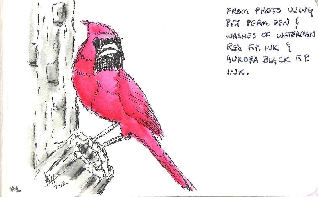
Waterman Red - This bright red ink disolves completely into the wash.

Mont Blanc British Racing Green - This is my all-time favorite green, which is why Mont Blanc stopped making it. As soon as that was announced, existing supplies were gobbled up and the only place to find it anymore is on eBay, for a price. Oh well, I'll find a replacement. When you wash this dark green, the original pen lines are left, dark and clearly visible. The wash fades beautifully into a grayish green.

Noodler's Red-Black - When you wash this ink, the red releases first, leaving dark "black" lines behind. A second wash will lighten up the lines to gray, but they do not disappear. On the wet-on-wet cross-hatching, this ink showed the least amount of feathering.

Levenger Cardinal - This is a slightly darker shade than the Waterman Red, but it behaves much the same way in a wash. The original lines completely disappear. I don't use this ink anymore because the nib creep was so horrible that I was constantly cleaning the inside of the cap of whichever pen I'd loaded it in. Levenger's customer service sent me a replacement bottle (see Empyrean below), and I'm happy to say that I've had no problems with that ink.

Private Reserve Spearmint - This is a much brighter green than the Mont Blanc, but it leaves similar dark lines behind in a wash and fades nicely to a grayish green color. Ignore the little red splotch in the corner there, a tiny bit of Cardinal was hiding in my waterbrush and decided to make an appearance.

Levenger Empyrean - Halfway between navy and bright blue, this ink is much better behaved than the other Levenger ink. There are dark lines left after the wash, but you can see where they feathered quit a bit, even though they didn't disappear. The lightest wash tends towards gray.

Thursday, June 21, 2012

Negative Space

Negative painting means you paint around an object to show that it's there.  I created the painting below as an exercise from Linda Kemp's excellent book, "Painting Outside the Lines".  Notice that I don't actually paint the trees, I paint the background around it and the tree shape appears.


This is a powerful technique and one I'm going to really have to work at to master.

Saturday, June 9, 2012

Pen and Ink

I almost always carry a fountain pen with me, it's what I use.  Recently, I ran across the idea of using a brush dipped in water to cause the ink to run in a (mostly) controlled way, creating shadows and tone.

I tried it, and I'm hooked.  As often as not, I'll carry my small sketchbook and now a waterbrush with me, to go along with my trusty fountain pens.  Below are some examples.

These first two I did at Hollywood Casino in Charles Town, WV.  My wife is an occasional gambler, I'm not.  I go, grab a cup of coffee and sit in the food court and people watch, read, and sketch.

Lamy Safari with Noodler's Red-Black ink.


Pentel brush pen.

One lovely Spring morning out back with the dog.  Lamy Safari with Levenger's Empyrean ink.